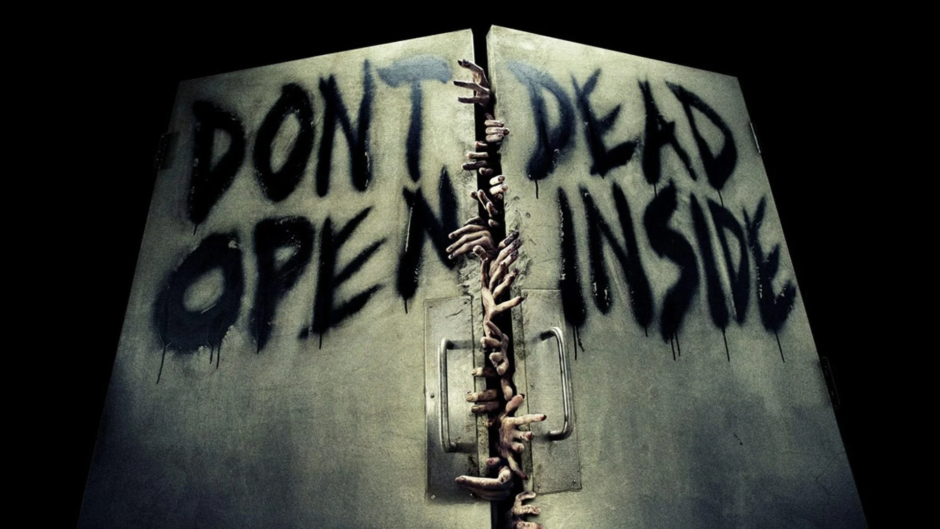
Don't Dead Open Inside
Published November 22, 2026
A 2010 promotional poster for AMC's The Walking Dead placed 'Don't Open' on one door panel and 'Dead Inside' on the other, but read top to bottom the words scramble into 'Don't Dead Open Inside.' Twitter users spotted the layout slip within days of the Comic-Con reveal, and by 2014 a dedicated subreddit was cataloging real-world signs, product labels, and storefronts that fell into the same trap.
Overview
Posts in the format pair a photograph of real-world signage with a caption pointing out the intended wording versus the accidental one. Common subjects include split-door warnings, stacked letters on store awnings, two-word product packaging, and funeral-home placards where grammar disintegrates under literal top-to-bottom reading1. The joke lives on the gap between what the designer meant and what the eye produces when it ignores column order.
A September 2019 variant paired the trope with the Floating Boy Chasing Running Boy template, labeling the floating figure with the garbled reading and the running figure with the sensible one5. Captioned screenshots from r/dontdeadopeninside gather every category of offender, so the format rewards anyone who photographs confusing signs. The dedicated subreddit is still the main gallery for new finds3.
Gallery
Origin & Background
How It Spread
Timeline
Frequently Asked Questions
References (9)
- 1
- 2
- 3
- 4
- 5
- 6
- 7
- 8
- 9