Decibel Level Charts
Published August 17, 2026
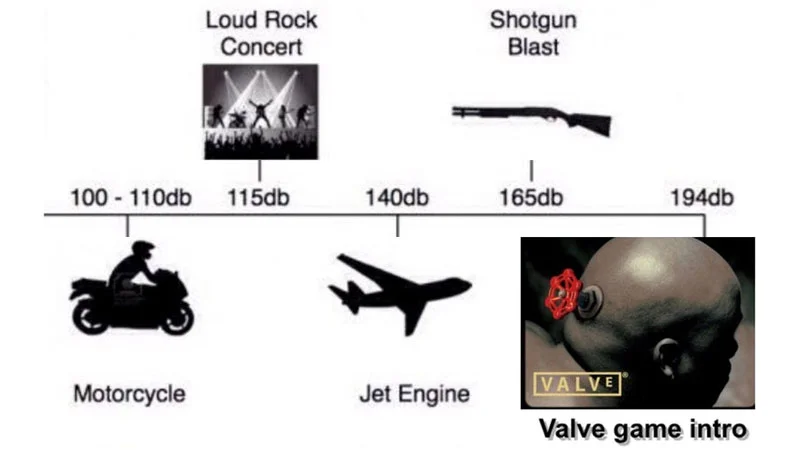
Decibel Level Charts, also called Noise Level Charts, is an exploitable image format that edits a real dBA infographic and adds a hyperbolic punchline above the loudest legitimate sound. The template took off on r/pcmasterrace in June 2016 and spread through Facebook and other subreddits during 2017.
Overview
Decibel Level Charts, also known as Noise Level Charts, is an exploitable image format that takes a real noise-level infographic and edits the top end to swap the loudest reference sound, usually a jet taking off, for a hyperbolic joke about something the creator finds unbearably loud 3. The base charts list ordinary sounds like whispers, conversations, lawn mowers and rock concerts against their dBA values, and the humor comes from the punchline slotted above the loudest legitimate entry.
The format lives on r/pcmasterrace, r/dankmemes and r/me_irl, where the added entry is usually a video-game gripe, a domestic mishap, or a targeted insult played as if it registered higher than industrial machinery 12. Because the template is a plain infographic, edits are easy to produce and easy to read at a glance, which is why the same layout is still recirculated whenever posters want to complain about a specific sound.
Gallery
Origin & Background
How It Spread
How to Use This Meme
A Decibel Level Chart typically starts from a real dBA infographic, keeps the ordinary sounds intact (whisper, conversation, traffic, jet engine), and adds one extra entry at the top representing whatever the creator finds unreasonably loud 1. The joke often lands hardest when the added item is quiet in reality, like a game menu, a dropped shampoo bottle, or a specific person talking, so the visual gap between the jet takeoff line and the punchline does the comedic work 2.