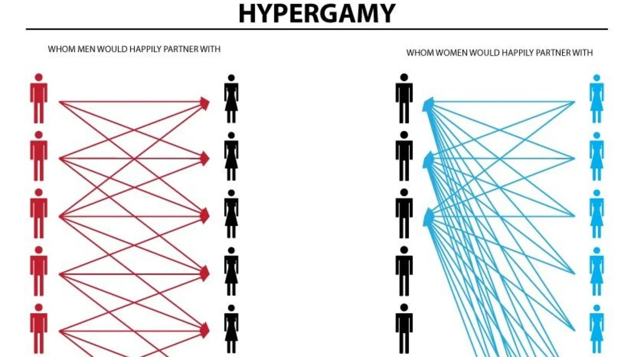
Hypergamy Chart
Published October 19, 2026
On November 19, 2018, Reddit user FactCheckOnTheFly uploaded a two-panel diagram to /r/WhereAreAllTheGoodMen claiming women only pursue top-tier men while men date across every status level. The Hypergamy Chart sat quietly for years before incel and looksmaxxing circles adopted it, then flipped into irony fuel in 2024 when /r/redscarepod remade it with Alvin and the Chipmunks. By late 2026, TikTokers were posting multi-million-view edits of dogs, frogs, and cloud visions reacting to the diagram.
Overview
Posts typically pit two side-by-side diagrams against each other, one showing men's dating preferences spread evenly across a status pyramid, the other showing women's attention clustered at the top. Posters in incel and looksmaxxing threads used the Hypergamy Chart as motivational material, citing it to argue that only self-improvement at the physical level could make a man visible to women1. The format spread outside those circles once mockery took over, with parody versions substituting cartoon characters, animals, and real celebrity faces for the stick figures of the original8.
By 2026, the dominant joke flipped the chart's bleak thesis on its head. Reaction-video edits set the diagram against footage of an animal or cartoon learning the "truth" and spiraling into existential despair4. Looksmaxxing communities still shared earnest versions on Instagram with assigned faces and body types5, while TikTok edits cast the Hypergamy Chart itself as a cursed object that destroys anyone who sees it7.
Gallery
Origin & Background
How It Spread
Timeline
How to Use This Meme
Creators typically match the two-panel diagram with a reaction clip of an animal, cartoon, or person spiraling after seeing it. Common conventions include reusing the Chipmunks edit template, assigning real faces to each status tier, or showing the chart appearing to a character in the sky or on a wall.
Frequently Asked Questions
References (8)
- 1
- 2
- 3
- 4
- 5
- 6
- 7
- 8