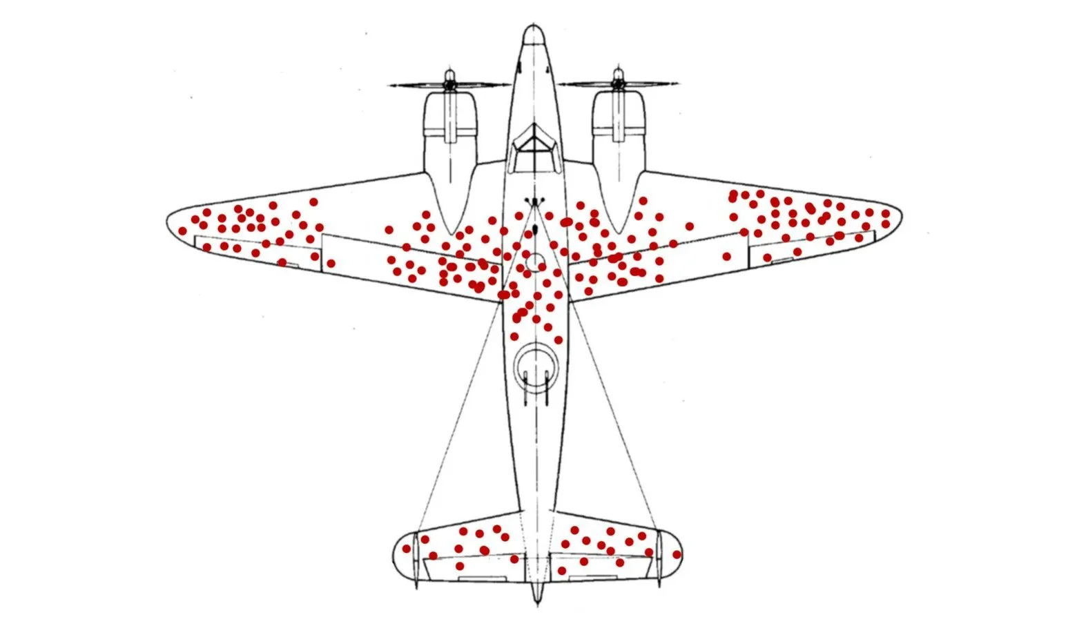
Survivorship Bias Plane
Published October 18, 2026
Survivorship Bias Plane shows a diagram of a World War II aircraft covered in red dots marking where returning bombers took hits, originally added to Wikipedia by editor McGeddon on November 12th, 20162. By October 2020, X and Reddit posters were setting it beside corruption charts, Trump approval polls, and online survey results to flag the missing data6.
Overview
Captions apply the WWII story to any dataset that only counts survivors. A typical post sets the plane next to a chart, poll, or self-help tweet with a sarcastic note about who the sample left out6. The red dots represent the obvious data in the joke, while the empty areas stand in for everything the study never saw.
On X, @dysmemic set the Survivorship Bias Plane beside a world corruption diagram, suggesting the map only shows corruption that investigators actually detected6. User @seecurity captioned the same plane with a line about an online survey finding every student had the required hardware for remote classes, pointing out that students without hardware could not answer8.
Gallery
Origin & Background
How It Spread
Timeline
How to Use This Meme
Posts typically place the Survivorship Bias Plane next to a claim, chart, or poll result, with a caption that points out which group never made it into the sample. Common conventions include matching the plane with a corruption index, a success-story thread, or a survey that only reached people with the thing being measured6.
Frequently Asked Questions
References (9)
- 1
- 2
- 3
- 4
- 5
- 6
- 7
- 8
- 9