Interest Graphs

2017image macroclassic

Published September 1, 2026

Interest Graphs are parody line charts that plot a person's attention rising and crashing across the topics of a conversation. The format broke out on Reddit in July 2017 with a viral /r/dankmemes post about talking to a left-wing activist, spawning a short but intense wave of drawn-out gag graphs across meme subreddits.

Overview

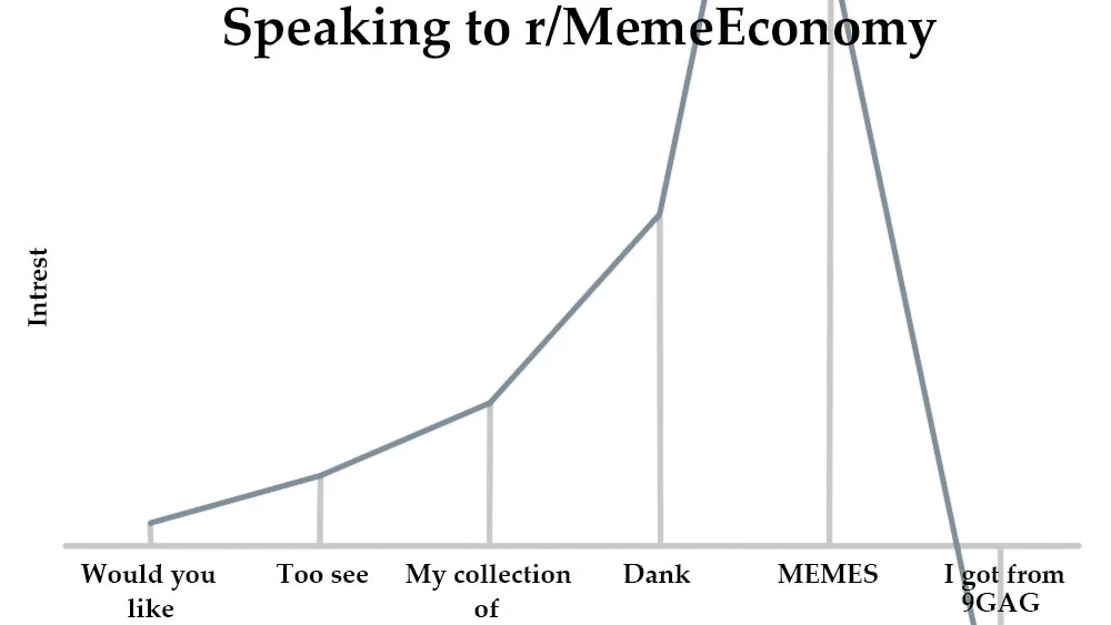
Interest Graphs are joke line charts where the x-axis is a sequence of talking points and the y-axis is how interested the narrator is in what the other person is saying1. The punchline is almost always the shape of the line, a smooth climb followed by a cliff-drop at the exact phrase where the speaker loses the narrator, so the reader scans the graph and reconstructs the awkward moment on their own2.

Most entries stick to a plain two-axis layout with hand-typed or hand-drawn topic labels along the bottom, and the humor leans on the specificity of those labels rather than on any visual polish4. Some versions swap in scribbled paper photos instead of clean digital charts, which became part of the format's low-effort charm on /r/MemeEconomy3.

Origin & Background

Platform
Reddit (/r/dankmemes, /r/MemeEconomy)
Creator
The_Lord_Of_Memes
Date
2017

On July 17th, 2017, Redditor The_Lord_Of_Memes posted a graph titled "Speaking to a Left-Wing Activist" to /r/dankmemes, with the interest line climbing through a list of social-justice topics before collapsing at the phrase "within Muslim culture"1. Within 24 hours the post pulled in over 3,500 points at 91% upvoted and around 110 comments, which is what pushed the format out of a one-off gag and into a recognizable template4.

How It Spread

Later that same day, Redditor sterodicsquirell posted a photograph of a hand-drawn interest graph to /r/MemeEconomy ending on the line "Would you like some chocolate covered raisins," which picked up more than 700 points at 96% upvoted in under a day3. The subreddit crossover mattered because /r/MemeEconomy users were already in the habit of tracking new formats as tradeable assets, so the graph gag got both remixed and openly discussed as an emerging template3.

A parallel wave hit /r/dankmemes the same day. Redditor HayItsProsandwich turned the format inward with an /r/MemeEconomy-themed interest graph2, while Redditor ThatNerdyBrunette posted a graph showing collapsing interest in memes once they show up on iFunny2. Having several unrelated posters run the template on July 17th is what marks the format's spread rather than a slow build4.

Frequently Asked Questions